Have you ever tried to compare the performance of Bitcoin to ExxonMobil?
At first glance, it feels like comparing apples to spaceships. One trades for tens of thousands of dollars, while the other sits around a hundred. If Bitcoin goes up by $500, that’s a minor ripple. If Exxon goes up by $500, it’s a miracle.
This "price bias" is the biggest hurdle for retail investors. It makes it nearly impossible to see which asset is actually working harder for your money. That’s where Normalization comes in and it’s one of the core tools we’ve built into our new portfolio dashboard.
What is a Normalized Chart?
In plain English, normalization "levels the playing field." Instead of looking at the dollar price, we pick a starting point (like $100 or 100%) for every asset in your list.
From that moment on, every line on the chart shows the relative growth from that starting point.
Why Should You Care? 3 Reasons to Normalize Your View
1. Comparing the "Incomparable"
Our database tracks over 10,000 organizations and the top 100 cryptocurrencies. Normalization allows you to put a blue-chip stock, a volatile crypto token, and a gold ETF on the same graph. You can finally answer the question: "If I had put $1,000 into each of these on January 1st, which one would be winning today?"
2. Spotting Correlations and "Laggards"
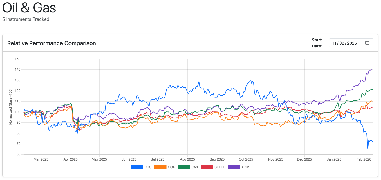
When you normalize prices, market patterns become visible. You might notice that while the energy sector is climbing, one specific stock (like COP) is trailing behind its peers like XOM or CVX.
Insight: If two stocks usually move in lockstep but suddenly diverge on a normalized chart, it might signal an overvaluation or a buying opportunity.
3. Stripping Away Psychological Bias
We are hardwired to think that "expensive" stocks (those with high share prices like Berkshire Hathaway) are "stable" and "cheap" stocks are "growth-oriented." Normalization strips away the nominal price and focuses strictly on percentage return. It forces you to look at the data, not the price tag.
From Watchlist to Insight in One Click
We’ve designed our dashboard to do the heavy lifting for you. You don’t need a degree in data science to get professional-grade visuals.
- Build Your Watchlist: Browse our database of 10,000+ corporations and top cryptocurrencies. Just hit the "Add" button to build your personal feed.
- Instant Visualization: The moment you view your list, our engine automatically generates a normalized chart.
- The "One-Year" Window: By default, we set your baseline to exactly one year ago. This gives you an immediate "Year-to-Date" style perspective on which assets in your list are leading the pack and which are falling behind.
- Complete Control: Want to see how they’ve performed since the 2022 market dip? Or maybe just over the last month? Simply adjust the normalization date, and the chart recalculates the "level playing field" instantly.
Whether you're managing a complex depot or just keeping an eye on a few favorite stocks, normalization gives you the clarity to make smarter, data-driven decisions.
Ready to see your portfolio in a new light? Give FinSxS a try.
Follow @Fin_SxS on X for updates.